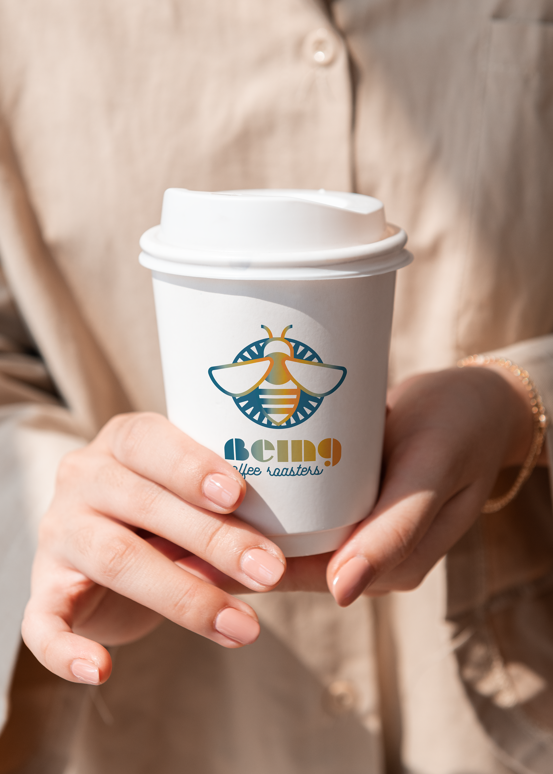
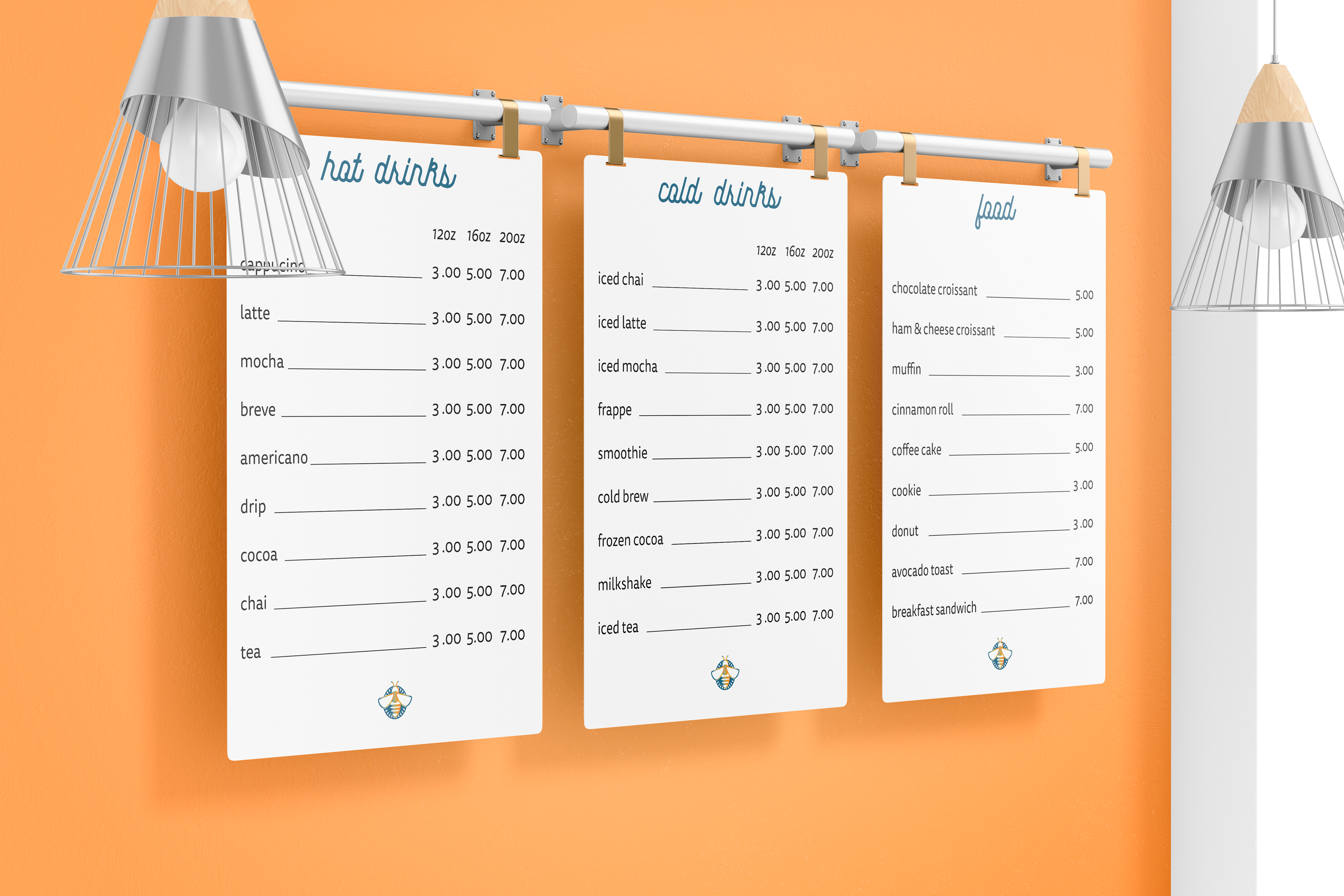
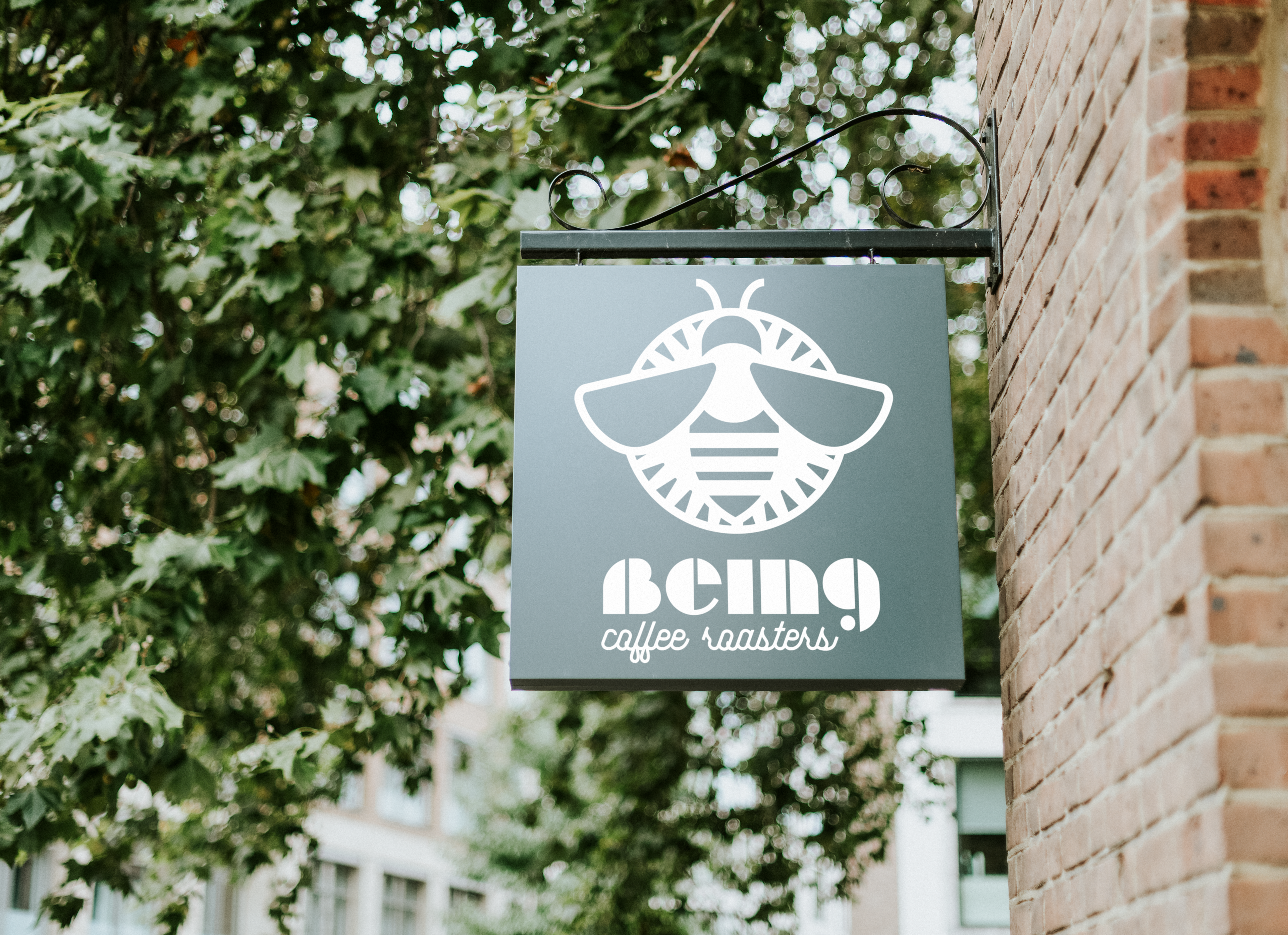
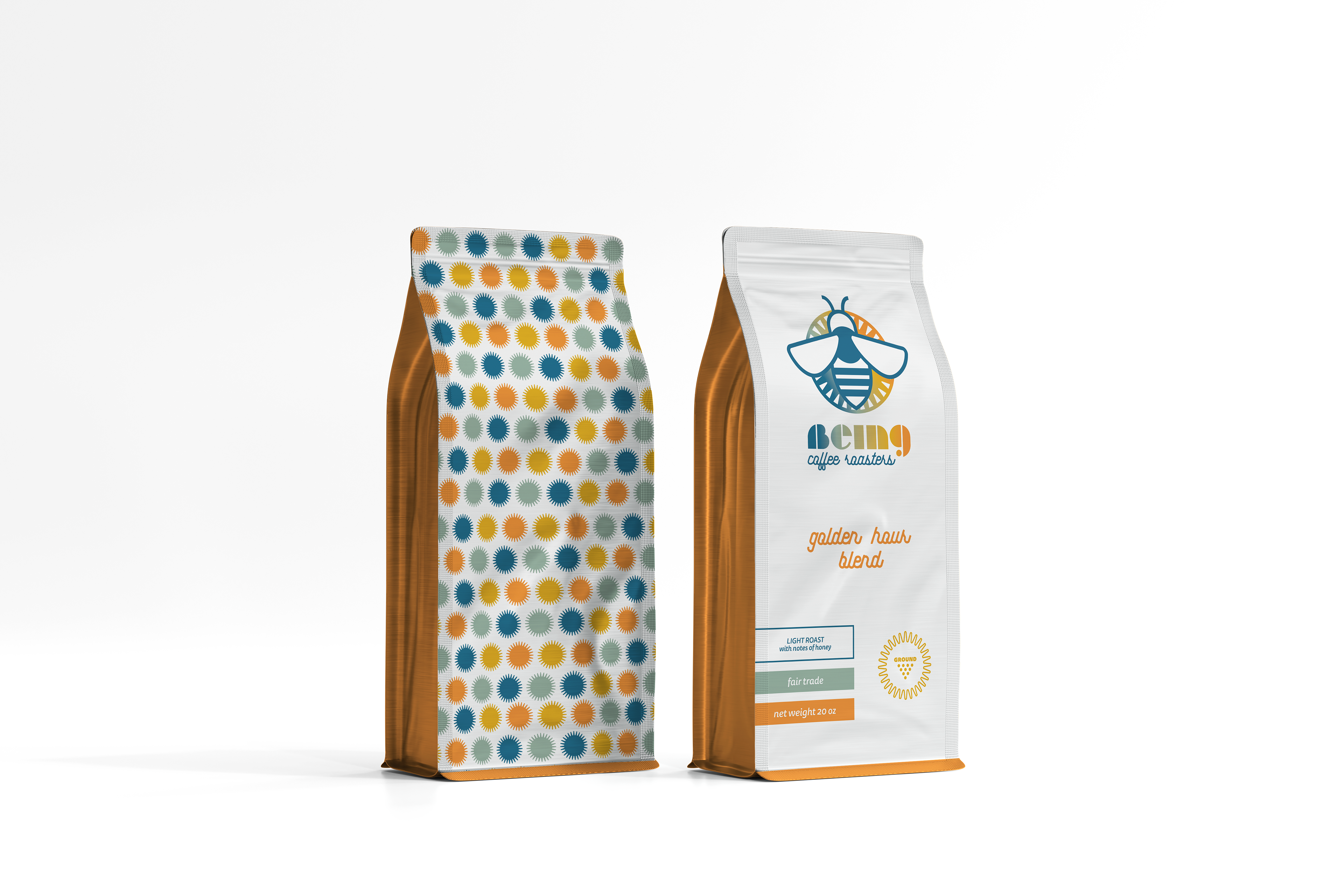
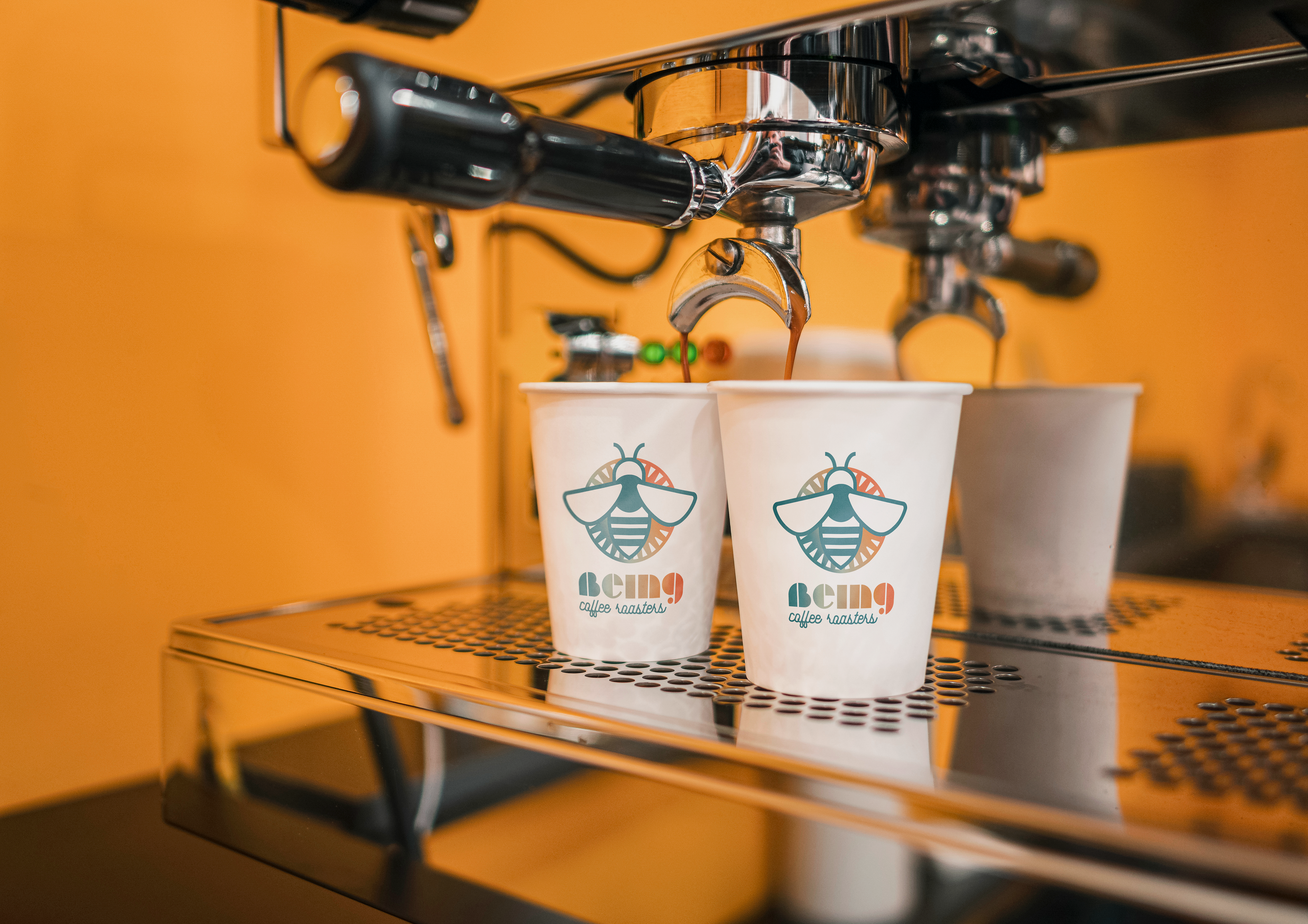
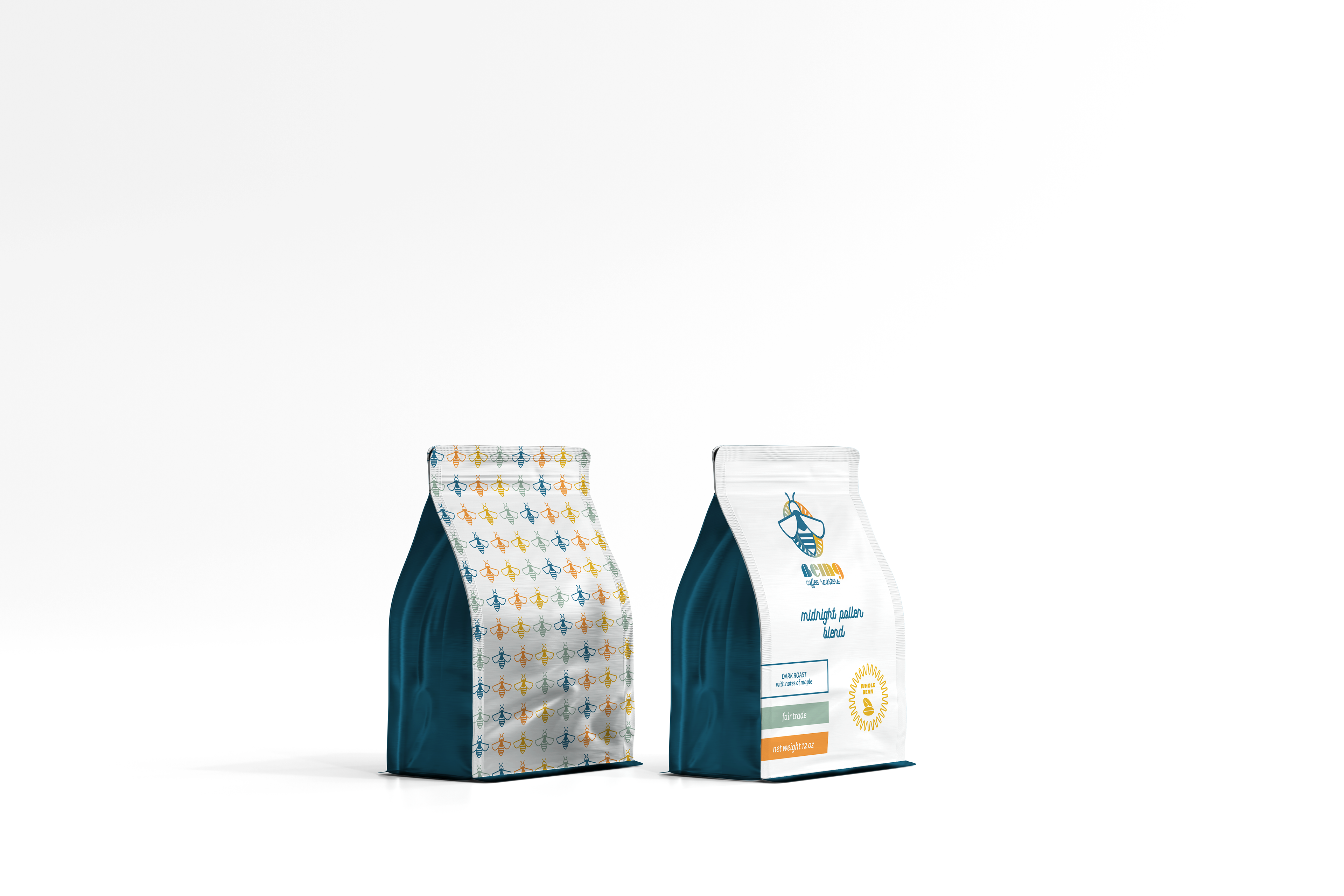
Hailing from San Francisco, California, Being is a bright spot in a city already brimming with life. At the heart of Being Coffee Roasters is the simple belief that we’re better together – coffee plants don’t need to be pollinated by bees…but when they are, both parties benefit greatly. The bee enjoys the caffeinated pollen and gets an energy boost, and the coffee plant produces significantly more coffee cherries. This concept can be applied throughout life – community is important to Being. They strongly believe in uplifting each other and often find customers sharing the love and paying for the purchases of other customers. The logo, representing the relationship between bees and the beloved coffee plant is indicative of the company as a whole. The colors, while bright and appealing, also represent the diversity of people who are accepted and wholeheartedly welcome at Being. Once again, we see a strategic utilization of contrast, with warm and cool tones as well as a modern, sans serif typeface paired with a symmetrical script, showing that life is not just black and white and that many different styles can be joined in harmony.
